Working at Disney and Lucasfilm has been quite a dream. Here I've been able to craft an art direction pipeline using the art bible as a primary driver for every department, and a communication tool for stakeholders outside the team. Each section is built collaboratively with buy in from every team member, meaning we are able to work together towards shared goals with a collective vision.
My goal here is to demonstrate the art direction process I used throughout Rivals, and how it is critical to a successful production. Understanding the IP, technology, medium (mobile devices), and scope can tell us what it will take to make any given game, and the techniques here are great ways to discover the answers to each.
Star Wars: Rivals


Star Wars: Rivals

Special Abilities

Resistance Hangar Battle
Game Overview
I joined Rivals at its inception and art directed each phase of development.
Final Level Art
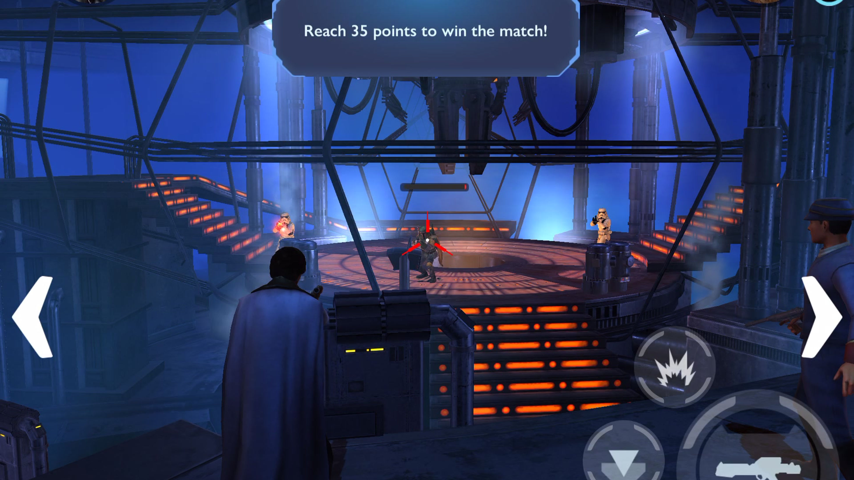
Final level quality was achieved after following a strong feedback loop of daily feedback, paintovers, direction sheets and review. Lighting and color remain a priority not only for the emotional, immersive factors, but also for clarity on mobile device. Levels of detail were held back, and value levels carefully monitored for playability on dimmed phones (a major consideration).

FUE
First Time User Experience
I led a small team tasked with creating the game's FUE, focusing on color as an emotional, brand authentic motivator. I wrote the script, drove the teaching sections, and created animatic previs videos. I also developed the title sequence, meta FUE, crate opening, and character reveal sequence.
Early levels are bright and welcoming and the teaching is light. As players gain combat experience, the environments appear sinister and foreboding, increasing the level of tension, drawing players deeper into the experience. This gave us a true on-brand experience that helped ease players into the game and gave them an experience that was authentic.
Final Character Art
Eventually the character style needed to be more realistic, and we were able to pivot to this direction but still retaining a level of stylization that would both be unique from other brand titles and remain clear on small device screens. Our likenesses were held in high regard by LucasFilm as benchmarks in mobile gaming.
Concept Panoramas
Rivals began as a 3rd person shooter to be visualized in a 'painterly' style, to give us a unique identity against the other Star Wars products. To start we created broad panoramas that gave an indication of what the look and feel would be like, helping establish an agreement between us and our LucasFilm partners on the tone of the game.

Art Bible
The project began with the creation of an all encompassing art bible, covering every discipline and outlining a high level approach for each. I set art pillars for the overall style, and spent time with the team deconstructing what Star Wars is, and how we would interpret that into a unique look for our game. I developed the idea of 'illustration brought to life' for the art direction, using the rich history of Ralph McQuarrie paintings and movie posters as a jumping off point.

Visual Targets
Next we developed more specific concepts to serve as visual targets. I wanted to use color and lighting as an emotional driver, a strong element from the films that players would recognize and connect to. To keep things from looking too serious, strong punches of color would be weaved in to keep things in the midcore range. We used locations that were familiar yet new, so we mainly focused on a post Empire timeline with the Yavin IV abandoned Rebel base, and Koranda, an entirely new, forgotten Imperial outpost.

First Iteration Levels
Our first environment began as a PvE level done in the stylized art style we had be building towards. This was our initial foray into bringing 'illustration to life' where we developed a painterly texture style, punchy color accents, and stylized materials. This was a modular set, with three distinct areas (landing bay, city, old Imperial fortress) to serve as narrative 'carrots', increasing tension as the level progressed.

Character Development
During pre-production we were tasked with creating brand new Star Wars characters, so I started out each with a broad reference based direction sheet that we turned into iterative character concepts. Then I worked with the concept artists to refine the ideas using lessons learned from the art bible. Lucasfilm's input would be blended in during this phase, getting the concepts to a spot where they could satisfy several different stakeholder groups. At sign-off we would create the workbook and begin asset production.

Color Palettes
A major element of Star Wars is its use of color, mainly through narrative to drive emotion. I wanted to bring this element into the game as a brand pillar, and did so directing color through a clear pipeline - from sourced colors derived from art and brand reference, to visual progression theory for tension and immersion, then to specific palette and lighting scripts. Every choice was base on brand identity, filtered through the lens of our game style in order to build a very specific emotional and authentic experience.
UI Development
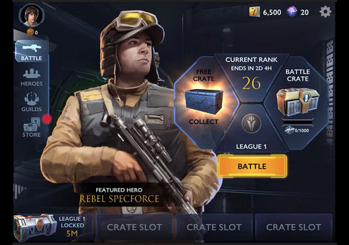
I guided the visual development of the UI screens, starting with the broad art bible, then zeroing in on specifics like 'attract mode pacing' , animated previs concepts, and palette structure examples to help break the team out of creative logjams. Our goal was to create something light and open, something fresh for the IP.


Resistance Hangar Environmental Effects

Character Unlock

Weapon Charge Up VFX

Pyro Denton DOT
VFX
I worked with the artist VFX to prototype and develop all the various environmental and weapon VFX. We worked through the same art direction pipeline, building ref, deconstructing, interpreting, and iterating. This is only a small sampling of the many, many effects we built over the project, but the breadth of contextual VFX is represented.
VFX Concepts
Effects needed to be interpreted from the films into a style fitting our game, and we used concept art to drive much of it. Articulate breakdowns showing life over time, color, and differentiation were key in setting up the VFX artist with a foundation he could use as a jumping off point. We iterated and took advantage of serendipitous elements as they occurred, allowing for multiple artists to contribute to a unique look.
Animation
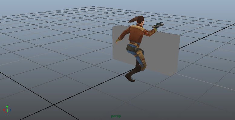
Animation followed a similar pipeline from art bible to ideation to iteration, focused on getting as much 'character' into the poses as possible. We chose a shared anim set but tailored to the majority of characters, as so many of them have specific ways in which they move. Dealing with a node based system meant that much of the final results depended on assistance from tech art to implement smooth pathing and timed entry into cover positions.


Team Logo
I designed and made the team logo (this also became our team t-shirt!).
I wanted it to look like a cross between the original Disneyland ride posters, and a Nasa mission patch...Disney rides because that's the experience we were creating, and Nasa because we were a unique team of mature specialists (hence each department's designation on the circle).
The twin sun and star field represent where we've come, and where we're headed...much like Luke's journey in the first film. Our team's namesake, the hammer, is positioned for you to grab and wield with responsibility, reaching upwards with the X-wing's graphic exhaust.
The Arubesh on the left reads, "Never Give Up".
I never will!


